Partridge Family Color Palette
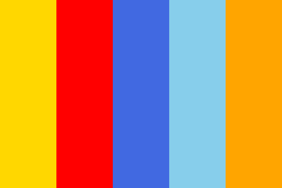
Based the image of the colorful bus, is a suggested color palette: White (#FFFFFF) - for the main body of the bus, representing purity and simplicity Black (#000000) - for the lines and accents, adding contrast and sophistication Yellow (#FFD70) - for the roof and parts of front, conveying cheerfulness and energy Red (#FF0000) - for the door and parts the side, symbolizing passion and excitement -Blue**4169E) - for panels, suggesting calmness and reliability **Light (#) - for other sections, adding a touch of serenity **Orange0) - for some, representing enthusiasm and warmth If you're this palette for a For instance, in graphic design or art-related positions, you could mention how this palette reflects your ability to blend classic with contemporary, much like the design of the bus. Marketing or Advertising: Highlight how these colors can be used in campaigns to capture attention convey a fun, brand identity. This could resonate well with companies bold, eye-catching visuals. Education or Community Roles: The bus could symbolize community and education (like school bus), so these colors might reflect enthusiasm, diversity, and inclusivity, which are often valued in educational or community-focused roles. If you need further customization or visual representation, let me know, and I can generate images or provide more specific suggestions!
Related Color Palettes
Comments
No comments written yet.
Please login to write comment.